Corporate Publications

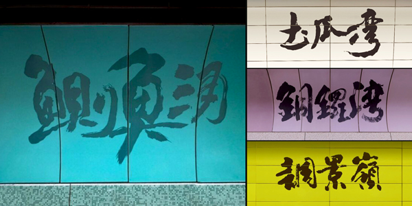
The calligraphy used for station names on the platforms was inspired during the design of the Hong Kong Island Line. At that time, the first chief architect of the MTR believed that large calligraphic characters would allow passengers to easily read station names from inside the train and serve as helpful reminders of upcoming stops. Additionally, the smooth, rhythmic lines of calligraphy could beautify the platforms and reduce the feeling of confinement. As a result, the design team chose Chinese calligraphy to adorn the station names, making the platforms more stylish and welcoming.
The choice of Cursive calligraphy was made because its dynamic, free-flowing lines convey a sense of motion, matching the energy of the trains. The harmonious proportions between characters also improve visual appeal.
Since the Chinese calligraphic art signs created by former MTR architect Abe Au were unveiled, they received widespread praise. This distinctive style was gradually adopted across other MTR stations, allowing passengers to experience the beauty of traditional Chinese culture and art while waiting for their trains.