Corporate Publications

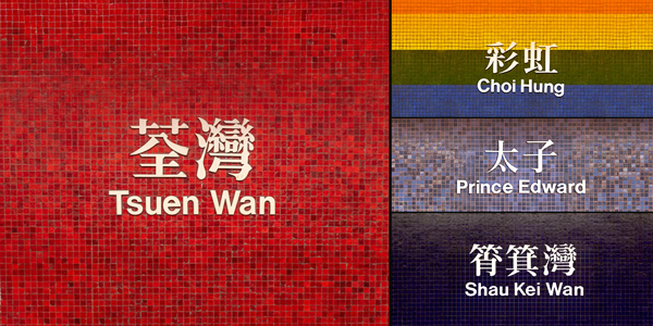
The MTR Typeface was created by the MTR Corporation’s design team.
The MTR Corporation places great importance on the wayfinding system at its stations. The “typefaces” are closely linked to “signages” and are one of the key visual elements. That’s why a standard Chinese typeface was created for station names and signages. This is how the MTR Typeface came to be, and it is fully owned by the MTR Corporation. This standard typeface has been used for station signs all the way to now.

Please click here to watch the video.
MTR Typeface is inspired by Song style typefaces. They evolved from woodblock printed lettering and tailored to meet modern reading habits, making it an ideal choice for station display.
This typeface represents Chinese culture and is widely used on MTR station names. The design of the MTR Typeface emphasizes detail, particularly in the finishing strokes. The “Gou” strokes capturing calligraphic traces such as thin, delicate lines, which make the typeface special and easy to recognize.
The design of Song style typically features thin horizontal strokes and thick vertical strokes. The MTR design team intentionally thickened the horizontal strokes in the MTR Typeface to create a more structurally balanced and upright character form that is easily readable at any distance, making it perfectly suited for station names and wayfinding systems.
To ensure the best possible wayfinding experience for passengers, MTR stations use a range of fonts for signage, selected according to the specific environment, in addition to their standard MTR Typeface.
Please click here to watch the video.
Remarks: